Data visualization (“datavis”)
Basic depictions of (typically) raw data
Infographics
Graphical representations of information (not necessarily data)
Exploratory data analysis
Statistical analysis without hypothesis testing
Statistical graphics
Graphics related to specific statistical procedures and their output (e.g, regression lines)
Exploration
Analysis
Presentation
Error bars or CIs: uncertainty of an estimate or variability of a sample or population
It is much easier to understand uncertainty if it is displayed graphically
So many things, but…
Trifecta checkup for a graphic
Do the answers to these questions match?
https://junkcharts.typepad.com/junk_charts/2019/07/what-is-a-bad-chart.html
https://howmuch.net/articles/highest-lowest-paying-jobs-in-tech
https://visme.co/blog/examples-data-visualizations/
https://junkcharts.typepad.com/junk_charts/2019/08/too-much-of-a-good-thing.html
https://medium.economist.com/mistakes-weve-drawn-a-few-8cdd8a42d368
http://jordan-vincent.com/night-under-the-stars
Showing change over time
How the timeframe of relationships has changed
https://flowingdata.com/2019/03/19/the-relationship-timeline-continues-to-stretch/
Day / night cycles
https://www.core77.com/projects/88862/Day-n-Light-Poster-Data-Visualization-for-Enlightenment
Different ways to present the gender pay gap https://junkcharts.typepad.com/junk_charts/2019/05/seeking-simplicity-in-complex-data-bloombergs-dataviz-on-uk-gender-pay-gap.html
Pie charts: good or bad? (Probably bad) https://junkcharts.typepad.com/junk_charts/2019/05/watching-a-valiant-effort-to-rescue-the-pie-chart.html
Does marijuana use increase on 4/20? https://junkcharts.typepad.com/junk_charts/2019/04/form-and-function-when-academia-takes-on-weed.html
This plot is really hard to understand https://junkcharts.typepad.com/junk_charts/2019/04/an-exercise-in-decluttering.html
Visualization of different brands of sake
https://junkcharts.typepad.com/junk_charts/2019/04/a-data-graphic-that-solves-a-consumer-problem.html
Graphs are better than tables
http://www.storytellingwithdata.com/blog/2019/3/19/march-dataviz-madness-table-vs-graph
Long history of information being depicted in figures
Graphics used in science after about 1600
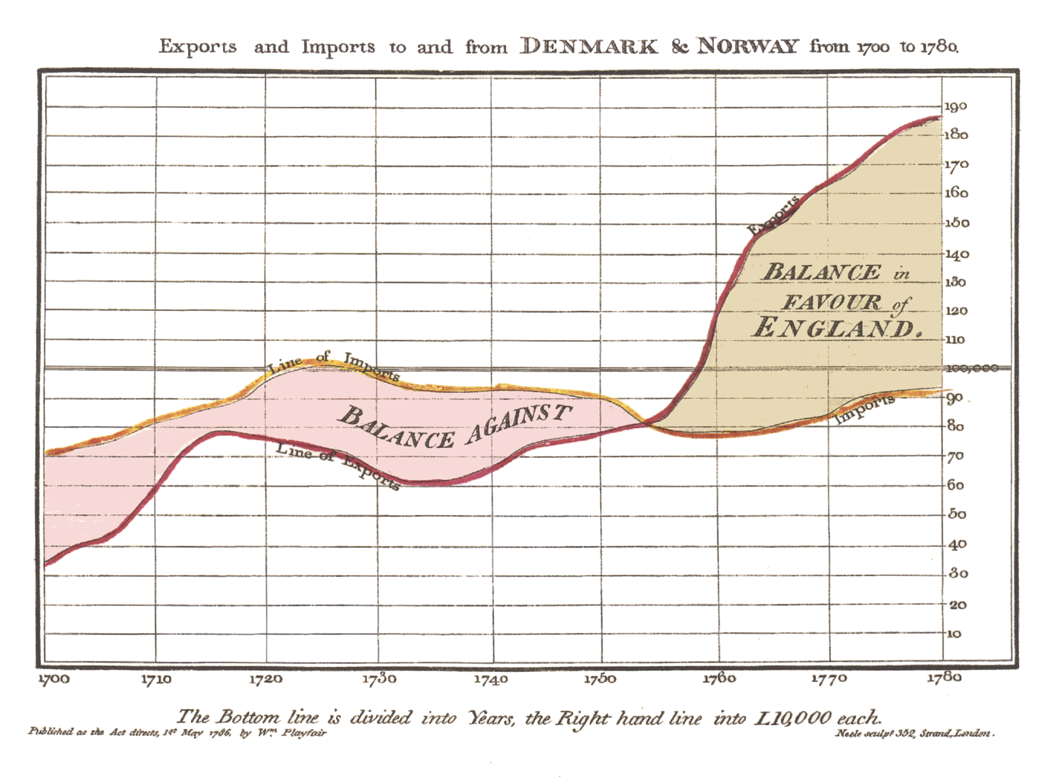
Scottish engineer and economist (also a secret agent)
Charts communicate better than tables
Most famous figure: https://upload.wikimedia.org/wikipedia/commons/5/52/Playfair_TimeSeries-2.png
French civil engineer
Best known for maps, especial “flow maps” that depict movement in both space and time
Most famous figure (English translation): https://upload.wikimedia.org/wikipedia/commons/e/e2/Minard_Update.png
English physician, helped develop modern aneasthesia use and medical hygiene, father of modern epidemiology
Most famous plot: https://upload.wikimedia.org/wikipedia/commons/2/27/Snow-cholera-map-1.jpg
Founder of modern nursing and sanitary reform, and statistician
Battlefield nurse during the Crimean War
Most famous figure: https://upload.wikimedia.org/wikipedia/commons/1/17/Nightingale-mortality.jpg
American sociologist, historian, civil rights activist, author
First African-American to earn a Ph.D. at Harvard
One of the founders of the NAACP
Sociology, history, and civil rights work was data-driven
Many famous plots. See a selection here: https://medium.com/nightingale/w-e-b-du-bois-staggering-data-visualizations-are-as-powerful-today-as-they-were-in-1900-64752c472ae4
Background in drafting, so focuses on the physical aspects of creating graphs
Wrote several books on charting statistics
Medium article on her: https://medium.com/nightingale/credit-where-credit-is-due-mary-eleanor-spear-6a7a1951b8e6
Swedish physician and professor
Emphasis on communicating statistics and science to lay audiences
Has several really good TED talks
American mathematician and professor, worked for Bell Labs, founded statistics department at Princeton
Credited with creating the box plot
American professor of political science, statistics, and computer science
Best plot (that’s not really a plot): The data duck
Software environment and programming language
Known for use in statistical analysis, but does much more
Can be expanded by writing your own code or using “packages” developed by others
Download here: https://cran.r-project.org/
To download to your computer: www.rstudio.com
Markdown is a markup language (like HTML) to format documents
Idea: you put in your content, let Markdown handle the formatting
Written in simple code
Final document can be in multiple formats (PDF, Word, Powerpoint, HTML)
Implemented in R via the markdown package
Reproducible!
Run your code and write your report in a single file
Make calls to parts of the output in the report
You don’t have to copy values from the results to a report document
Can easily upload HTML files to a webpage using Rpubs (integrated with Rstudio)